Concept Art – Viking Islands (Updated)

viking-floating-islands-copy

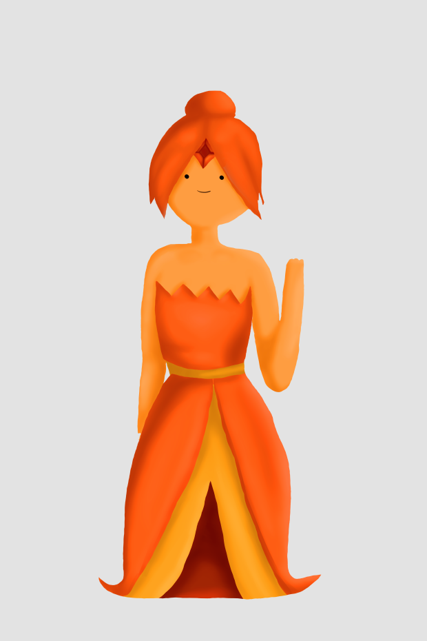
I finished concept art for Tony which he wanted handed in by the end of the month. He helped me fix the composition of the piece by using the rule of thirds and asking me to put something in the middle-ground of the piece as it started to look strange and didn’t know how to fix it.

I started out by filling in block colours with the person and I did the same with the background. I then started to fill in some basic shading and started to go in with some ambient and directional light. For the islands I was having trouble just drawing them so I went into 3DS Max and quickly created some shaped that I could use for shading reference and a good outline. I ended up picking this one.

dhdhdhdhdhd

It didn’t really matter about geometry or topology at all, as I was just using it for reference. I picked a good earthy brown and started to create some colour and went through the same process for all of the floating islands. If I didn’t feel like some areas weren’t dark or light enough I would turn down the opacity down and just go over it a little to get to the desired shade. After I was alright with colour and everything I did, I used the photo editing tools like levels and curves to adjust the picture, I also made it a little redder as it was looking too cool. I made a slight vignette to try and keep people in and try to keep their eyes focused in the middle.

I’m happy that this turned out alright could have spent more time on it and it would have looked better, I’m good at colour and understanding how it works although I still need to improve on it.

Concept Art – Viking Islands

viking floating islands1.png

This is my concept for Viking Islands, they’re all floating islands and on-top of them is quite primitive building with basic tech like a modern kettle and a fridge inside of the building which I will do next after I have finished this piece.

First I started by filling in basic volume and where I would like things to do in general without thinking about any lines and over-complicating it straight away.

viking floating islands2.png

I then created the line art for the person and tried to keep the pose right, I don’t think the arm on the right looks right but I’m not overly worried about it, I have the person wearing modern clothes as that would be a part of modern tech as they need machines to do it.

viking floating islands3.png

Once I am happy with all of my line art I then started using the lasso tool to create a silhouette of the figure and fill it in, after I have done that I could then paint in the same colour to make sure I got everything and that it all looks full and not jagged edges. After I’m happy with that I can use the magic wand to select all of the silhouette and create a mask and linking it to a folder by clicking this yeyeyyryh the mask tool. This makes sure that nothing can go outside of the lines that I have drawn.

viking floating islands4.png

Now that I’ve done the initial one I can now create a mask for the hair, skin, shirt, and skirt so I can’t just draw a line over them and would speed up my painting process. I started to create some shadows in it before I think about ambient and directional light.

I’m happy with what’s happened so far and I’m good with using colour and how to use Photoshop, I could improve by  spending more time editing the anatomy and probably could have fixed the arm if I didn’t worry about it too much. I haven’t finished yet so I could still improve by continuing to work on it and start filling in the background some more.

Mudbox – Basic Rock

hgjgjg.PNG

With Tony we made a sphere by turbo smoothing a cube, which is better for topology and smoothing groups. we then used the grab tool to pull it and make it look more defined. Next I used the flatten tool to try and make it look rugged and sharp by targeting corners and rounder areas.

TexturesCom_Cliffs0356_1_seamless_S.jpg

Once we were okay with what the model looked like we then found a texture image online and then use a painting stamp image tool to paint the image onto the rock which I thought was a very interesting feature.

I’m happy that this all turned out okay but I wish the model itself could have looked better and maybe chose a different texture. I think I’m okay with Mudbox but could be much better and could improve by spending more time on it.

Environment Moodboard

Tony asked us to start thinking about creating an environment that was Viking/Nordic but included future technology. I thought to create a mood-board to start creating some ideas and have references for work when I need them. My next move is to create some thumbnails to really start the process.

Environments

rocks.png

We had to start working on environments and tony was trying to help us. We started by drawing a rock by using the poly lasso tool in Photoshop, after we filled it in and created a clipping mask so we couldn’t go outside the lines, we used the gradient tool to create a shadow. After we finished the rock he asked us to create a brush with it by going into edit, and then define brush preset so it appeared in my brush menu.

cloud.png

He asked us to do the same with a cloud that I found on google images by turning it black and white, and inverting the colours.

rocks-n-stuff

Using different layers for background, middle-ground, and foreground. He asked us to try and create some shapes that could create an environment. I put the clouds in there as well to create a sense of foreboding. Once we did all that he told us to go in and change the hue of the layers to give it colour because it was just black and white beforehand.

I think this was a fun thing to do and I could improve for next time. I’m happy that we got to be creative but I wish I had better tools or I had more time to improve on it.

Adventure Time

fireprincess.png

Drawing this was the first time I was able to properly experiment with layer masks and using them to further my digital art skills. I started with the sketch I did in Tony’s class, then used the selection tool to outline it and filled it in with a grey so I know where it is. Afterwards I selected specific areas of it such as hair, top, skirt, skin, and accessory’s. I used a layer mask on all of these areas to make it easier to just shade.

At the end of all of this it kinda turned out like clay but I’m happy that I understand how layer masks work. I could improve with color because it can always be better.

fireprincess

Storyboard

storyboard

We all had to draw a quick storyboard so we could understand how they plan for sequences. I came up with an animation idea which isn’t serious but it would be fun to do. In this short scene a girl gets pulled under by a huge creature when she’s standing in a small stream, after she’s pulled through the water she get pulled through the “other side”. In this lesson tony helped my understand clipping masks because I’ve been having some trouble with it.

I’m happy this turned out pretty well for a quick sketch which I will work on later with shading. I could improve on proportions which have always been a problem for me.

Silhouettes

crazyshapes

Tony asked us to create silhouettes and try to make basic shapes as a starting points for figures. I selected the lasso tool and once I made rough sketches with it I filled it in with black to give the results above.

I’m happy that it did come out with some interesting shapes, I could have took more care so they would look better. I’m good at using Photoshop and other painting software, but there’s still a lot to learn about it.